
Responsive Web Designer in Vermont
Esker Designs is a responsive web designer in Vermont that builds custom websites for small businesses across the country. Having a responsive website that looks great on all screen sizes is an important part of user-experience, but also how search engines rank your website.
Our websites look sharp and work perfectly on every phone, tablet, and desktop your customers use.
Start Free Today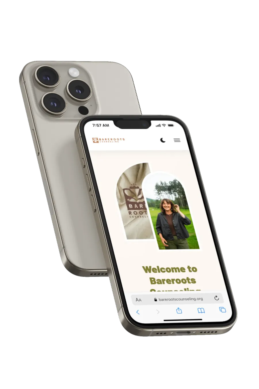
Look your best on all screen sizes.
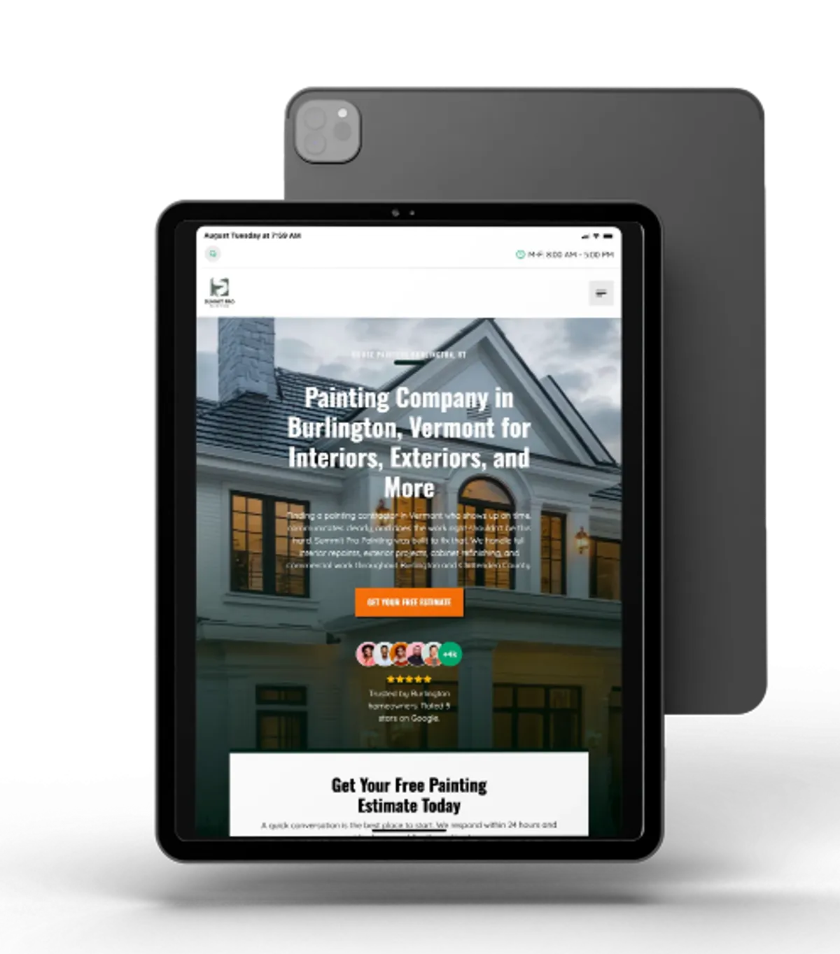
More than half of your visitors are on a phone. We design for mobile-screens first and then scale up, so your site is just as clear and easy to use on a small screen as it is on a large monitor.
Every layout, image, and button is built to adjust to the screen it lands on.
Fast loading sites on all devices
A responsive site that loads slowly on a phone still loses customers. We hand-code every site and compress every image so your pages load in about a second, even on mobile data.
Speed is also a Google ranking factor, and Google indexes the mobile version of your site first. A fast, responsive build helps you rank and keeps visitors from leaving before your page finishes loading.
Start Free Today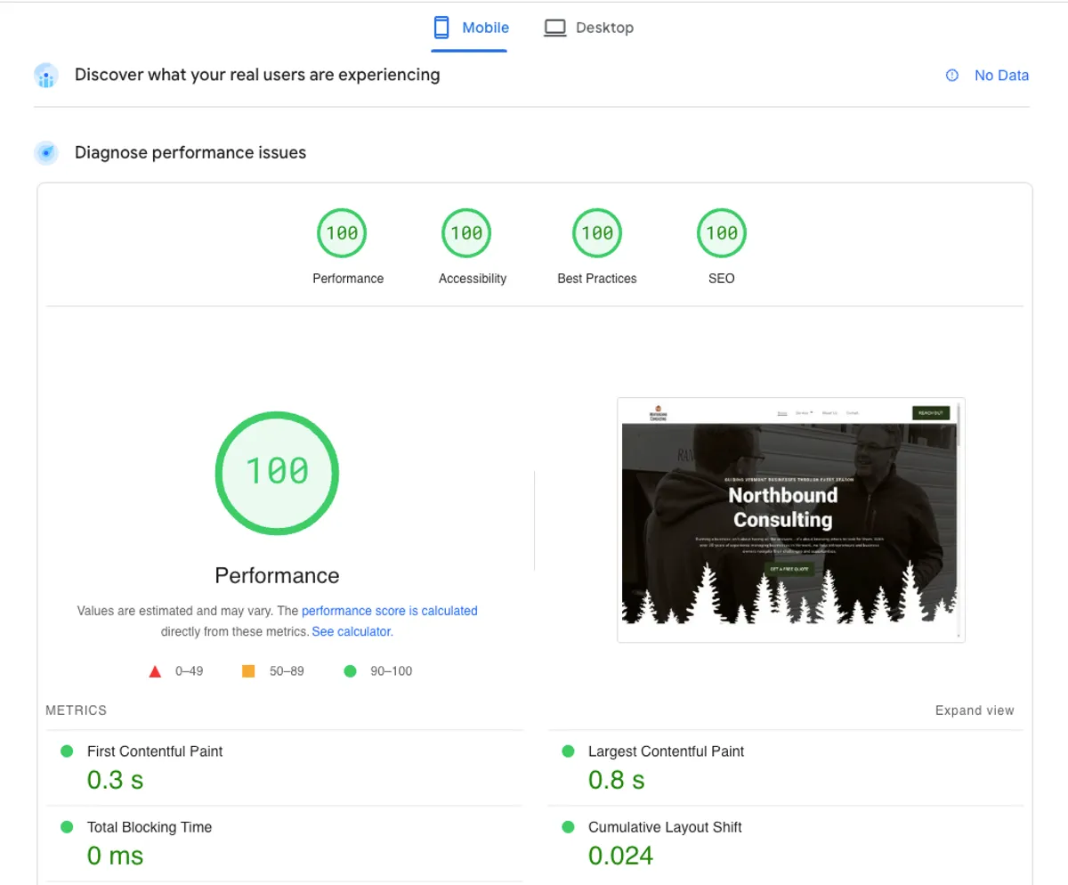
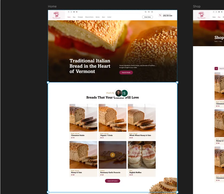
We offer a robust design process.
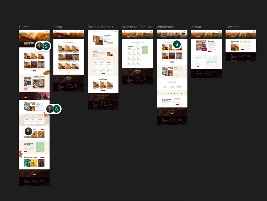
Our goal is to make sure you love your new website, so we design all our websites in Figma before writing any code.
Figma allows you to see an ultra-realistic mockup of your future website, so that there are no surprises at the end of the process. We offer several rounds of revisions, and you can drop comments right into the design file.
Start Free TodaySigns Your Current Site Isn't Truly Responsive
Not sure whether your current site holds up on mobile? If any of these sound familiar, your website is costing you customers on the devices they actually use:
- Text is tiny and visitors have to pinch and zoom to read it.
- Buttons and links are hard to tap without hitting the wrong one.
- The layout breaks, overlaps, or scrolls sideways on a phone.
- Pages take more than a few seconds to load on mobile data.
A rebuild fixes these without starting your brand over from scratch. Getting started is free, and there is no obligation to move forward.
Start Free TodayHear From Businesses We've Built Websites For
We have built websites for all kinds of small businesses. Here are a few of them on what it was like to work with us, and what their new site has done for them.
"We started working with Sam and within a week, we sold a masonry job big enough to pay him for a couple years! I would definitely work with him again."
–John, Righteous Chimney and Masonry"Working with Sam was super easy from start to finish. When he showed me the website I was blown away. I've definitely noticed more leads since launching the site and a higher closing rate because my clients can trust me right away. I had to have Sam set up a spreadsheet to track all my inquiries since I was getting too many leads."
–Jules Butler, Butler Yardcare"I've worked with Sam for the better part of two years and I have nothing but good things to say."
–Jackson, Summit Pro Painting

Responsive Web Design FAQ
A responsive web designer builds a website that automatically adjusts its layout, text, and images to fit whatever screen it is viewed on, from a small phone to a large desktop monitor. Instead of one fixed design, you get a site that stays clear, readable, and easy to use on every device.
Open it on your phone. If you have to pinch and zoom to read the text, the buttons are hard to tap, the layout overlaps or scrolls sideways, or pages take several seconds to load, your site is not truly responsive. A free consultation will tell you exactly where it falls short.
Yes. Google uses mobile-first indexing, which means it looks at the mobile version of your site to decide how you rank. Page speed is also a confirmed ranking factor, so a fast, responsive build gives you a stronger foundation to rank than a slow or desktop-only site.
Every site we build is responsive at no extra charge, because we do not treat mobile as an add-on. Our websites are $175 per month with nothing down, or available as a one-time build. You can see the full breakdown on our pricing page.
We are Vermont-based and love working with local businesses, but we build responsive websites for clients anywhere.
Start Your Website Today
Ready for a website that looks sharp on every screen and loads fast on every device? Tell us a little about your business and we'll take it from there.
It starts with a short, no-pressure call to talk through what you need. There is no cost and no obligation to hire us.
- Call (828) 989-1290
- Email sam@eskerdesigns.com
